
Expressing meaning in typography and composition
Q1:
The first task in this Lesson task was:
Create a new word; one which has no dictionary definition and a meaning that only you know. For example, the word we came up with is “roleean”, it doesn’t appear in the dictionary, but it means, “round and leaning to the left”. You could decide on your own word with its own meaning. With regard to our new word “roleean”, this might involve emphasising or dramatically enlarging the letter “o” within the word, and using italics, allowing the letter to lean to the side.
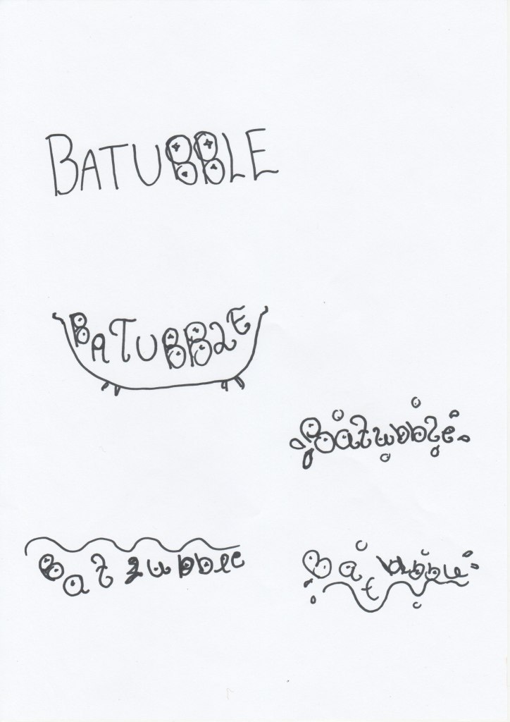
I started the task with writing down some random words, I tried to put the words together to create new words. I thought of taking a bath later and wrote down bath, bubble, swim, bubblebath and bathbomb. I tried to put them together to create a new word. I wanted Bubble and Bath together because I got the idea of how I wanted to compose the word, but there is already the word bubblebath, so I created a new word out of this. New word: BATUBBLE.
Q2:
Now choose two extra words from the list below:
- Fluffy
- Falling
- Slimy
- Agony
- Sailing
- Rock-Solid
- Loading
- Pizzaz
- Accelerate
- Elevate
- Create
- Inspect
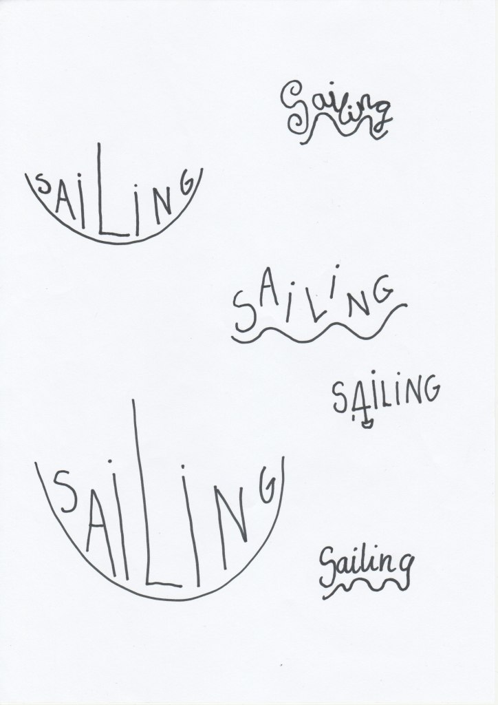
After I had read through the words, I chose Sailing and Accelerate and began to think how I wanted to compose the words.
Create three different compositions, showcasing your three words, one word per composition. In each composition, arrange each individual word to express its meaning, using only the colours black and white. Consider all and any means at your disposal: dramatic scale contrasts, cutting, repetition, letter spacing, etc.
Each composition should fit onto an A4 format. You can play with the size, spacing, placement and orientation of letters while being cognisant of how the word(s) interact with the entire format.
Consider the entire format as an important design element: use all available space; don’t simply centre the word – think of this as an opportunity engage the viewer throughout the entire layout. Experiment. Play. Push to the edges of the page. Repeat elements if it helps to get the meaning across. Choose a very simple creative solution, if you find this direction more appropriate.
Make sure to only use one typeface for each composition, noting the suitability of the choice of typeface to the individual word; you can experiment with various styles (light, bold, condensed, uppercase, lowercase). You may repeat, omit, slice, block or overlap words or letters.
Q3:
Now that you have done your planning and sketching it is time to finalize your designs from Question 1 and 2 and post it to your blog.
You will need to supply all your preliminary sketches and ideas along with the final layouts from Question 1 and 2 – the foundational process of drawing by hand is important.
Optional: You can use a program such as InDesign or Illustrator to rework and refine the designs if you have the time, to get some practice with the software. Please do not use drop shadows or similar computer-generated effects.
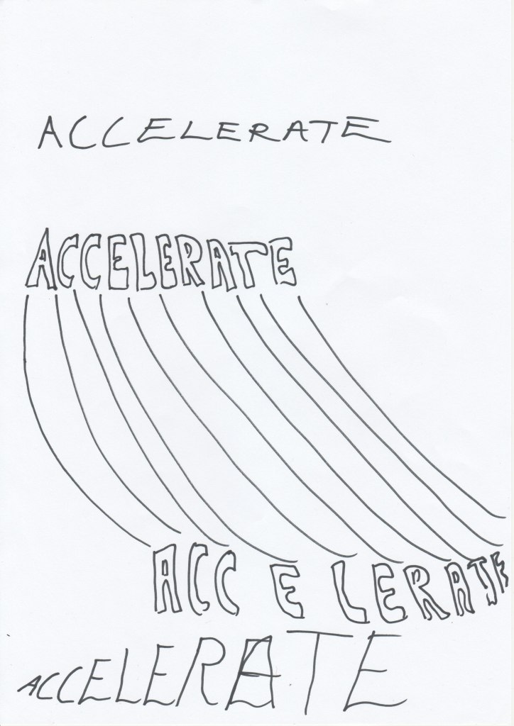
Here are my sketches:
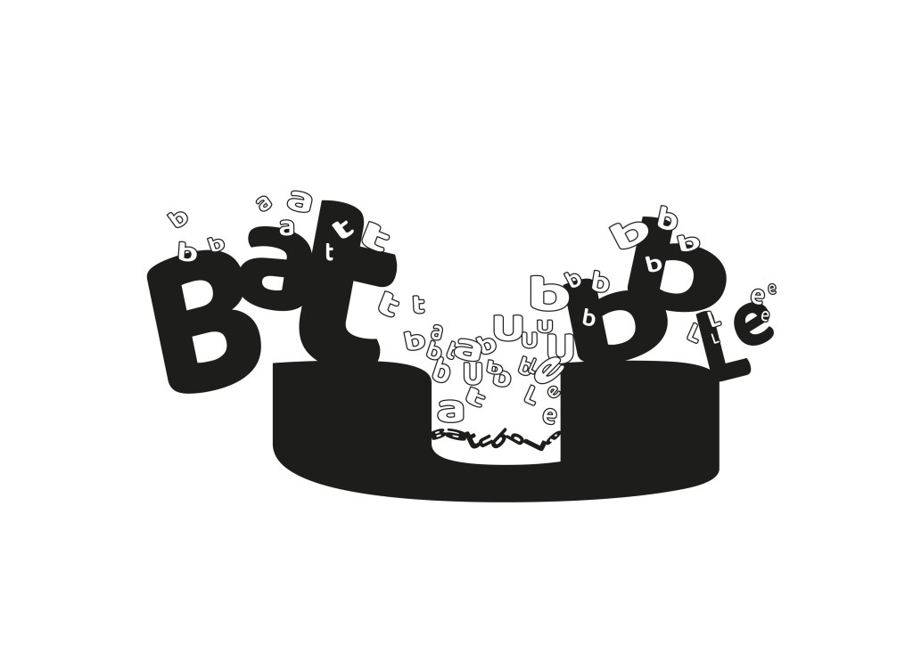
I chose to compose the words in Illustrator. Here are the final illustrations:

In the «Accelerate» illustration I used Arial Bold font. I wanted to show with the words that they increase the speed.
In «Batubble» I used Baloo regular font. The «U» in the composition is supposed to look like a bathtub and the white letters are bubbles.
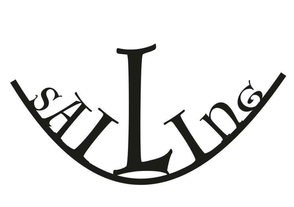
In «Sailing» I used Luminari font. I wanted the letters to go in the form of a boat and the «L» is the sail in the boat.
