
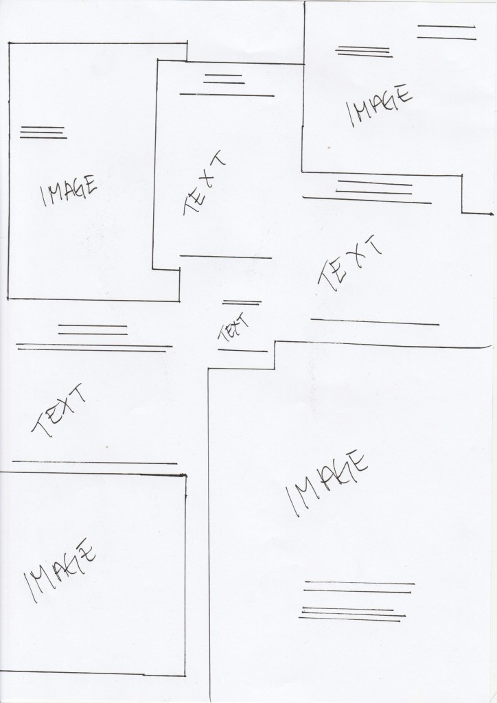
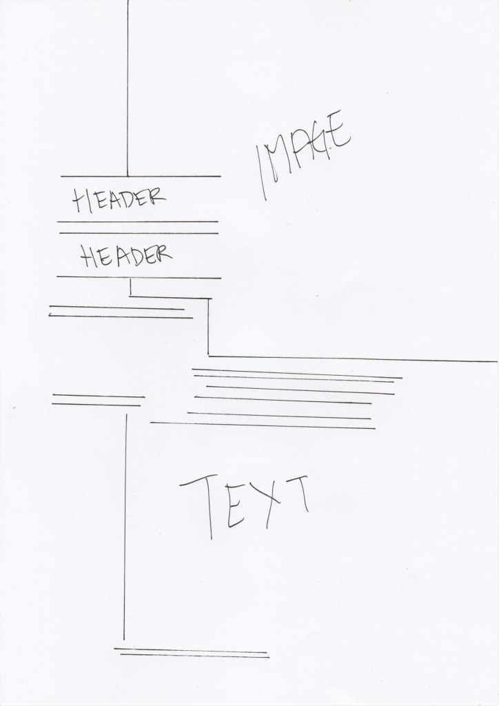
Take a magazine, newspaper or book that includes images and text. Lay tracing paper over the top of three spreads (both left-hand and right-hand pages). Using a pencil and ruler, carefully trace the grid underlying the page layouts. Remember to remove specific text elements or images, and to only draw the grid lines. Note column widths and margin sizes at the top, bottom, and to the left and right of the main body of text. Is your document based on a two-column, three-column, or another type of grid? Which elements stay the same on each page, and which change?
Here are my findings and my tracings from Elle Norge magasin (November 2020 issue)
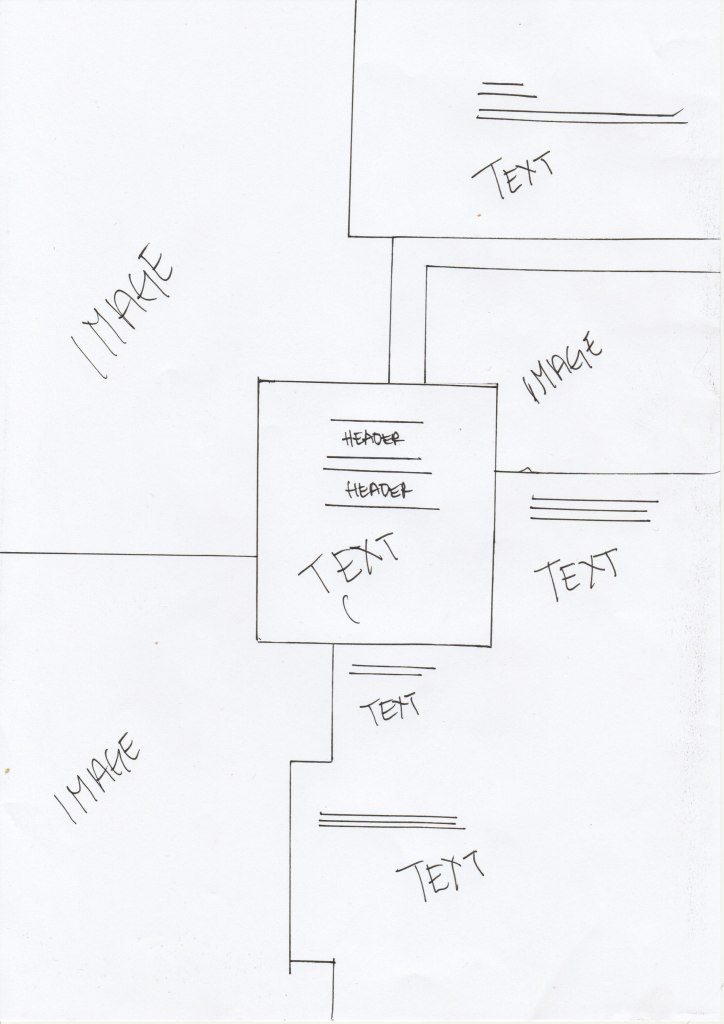
«Trend» page
«Trend» page
«Portrait interview» page
The pages was a little wider than an A4 page. Elle used a three column system, since it is a mid-range amount of text. The margin on the bottom was consisting. They have placed the text and images asymmetrical on the page and have used the white space to divide the images and text. The page number was placed the same on each page, but the header was placed different from the trend page and the portrait interview.
