
Compare the design (in terms of pace and contrast) of an online magazine, blog or website to that of a printed magazine, book or journal.
What differences can you see between the kinds of design strategies used in the two formats?
Here are my findings:
I used the Elle issue I had to compare it with their online magasin.
I noticed in the printed magasin, that there are a lot of pictures and small text beside/under/over. The focus is the pictures and you can choose to read the text that are on the pages. Elle’s magasin is mostly three columns and asymmetrical, the images are spread around on one page and I feel in comparison to the online magasin, it is more «filled» and more information to get from one page.
In the online magasin, it is much more symmetrical and structured. It contains of big pictures, but it is build up like a blog, with images and more text to read below the pictures. It is more tidy and not many pictures around the page, but in a chronological order.
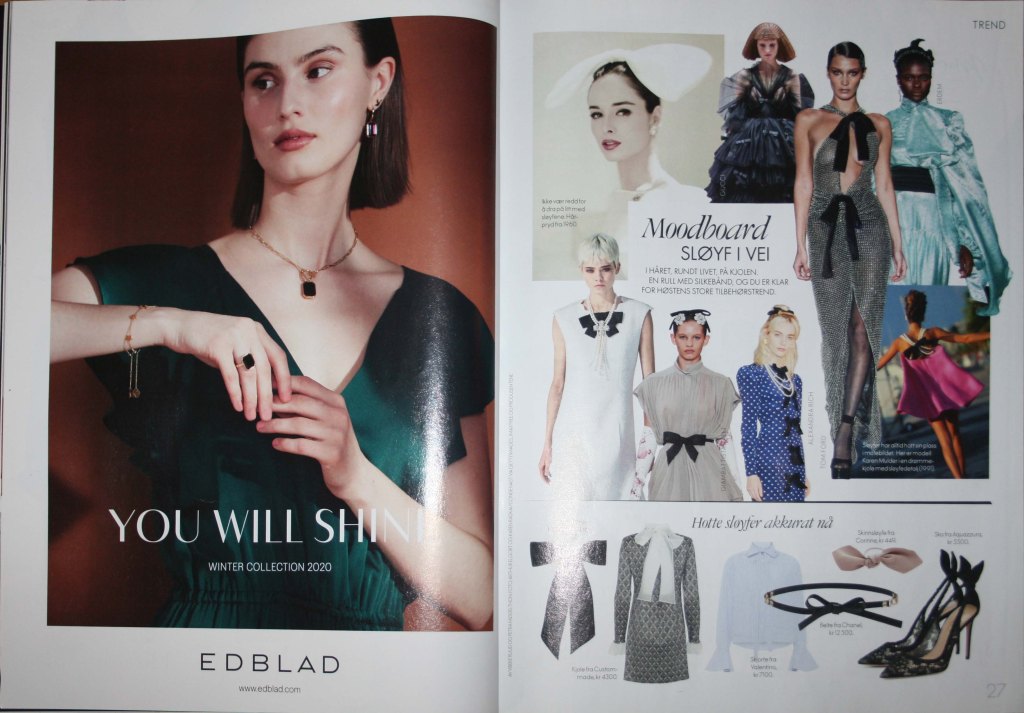
The Elle magasin November issue
Here is the online magasin: https://www.elle.no/
