
Develop a name for a dog food product. Design a logo for this product, using full colour. The logo must contain a main visual and typography.
Follow each of the fundamental steps outlined above, in that sequence and take note of what needs to be handed in as you progress through these steps:
1.Exploration – Use sketching techniques to draw thumbnails and hand in your thumbnails as scanned PDFs.
2.Focus – Highlight three of the thumbnail ideas that you consider the best options and state why. Hand in an A4 with visuals of the three chosen thumbnails; include reasons for choosing each of these three options.
3.Construction – Use sketching techniques and redraw ONE of your chosen concepts until you’ve reached a conclusion on a successful logo. Hand in your drawings as scanned PDFs.
4.Testing – Experiment more with your favourite options from Step 3 and ask the opinion of a few people. Hand in examples of the logos shown to people and write their feedback or opinion on each.
5.Refinement – Choose your final design and execute it in Adobe Illustrator, along with the name of the product. Hand in your final logo as an A4 PDF.
The first thing I did was to develop a name for mye brand. I researched and thought of what I wanted the brand to represent and made a list with possible names I wanted to use. I visualized a happy dog! I wanted the brand to be focused on creating premium dog food to make dogs around the world happy! And what does a happy dog do? Wagging their tailes. It was between two names, «Waggytails» and «Tailwags». I decided to use Tailwags.
1.Exploration:
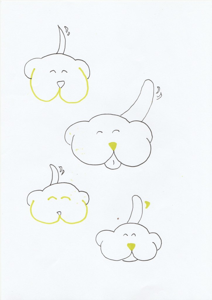
2.Focus:
Here are the three favorites. I wanted to express the tail wagging and or a happy dog! The first one I think was fun wordplay with the «W» as the mouth of the dog. But maybe not as a logo on the packaging? I think there is too much going on, but it is displaying a happy dog! The next sketch could work, it is cute, simple and showing the wagging tail. The last sketch is showing a happy dog and the wagging tail, it is simple and portraying the message of the product name.

3.Construction:
This was my favorite in the end and here are the sketching and redraw of the chosen concept:
4.Testing:
I got mostly positive feedback when showing my sketching to people. There were some details on the drawing that some gave me feedback on. For example make the nose and tail bigger, make the head smaller, make the head and the tail allign and maybe drop the tounge. The first and the last thumbnail was the favourites. I also got some tips on which colours they thought I should use when drawing the logo in illustrator.
5.Refinement:
Here is my finished Logo for Tailswags (I added one PDF file and one JPG file)

