
Find two websites: One that shows good typography design and another one that doesn’t. Then explain why the good one is good and the other one is bad.
I chose these two websites:
http://www.irishwrecksonline.net/
Bad typography:
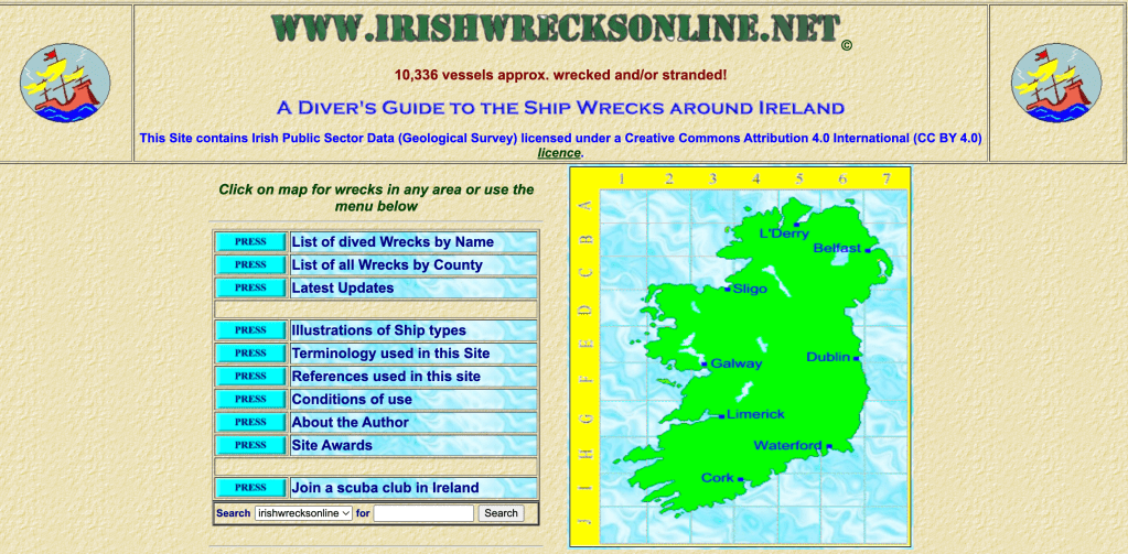
The typography on this site is hard to read and there is no consistency to the design. The different colors on the text and the fonts that are being used makes it hard to navigate and it looks like there is just text being thrown to the page not implementing into the site or the design.
Good typography:
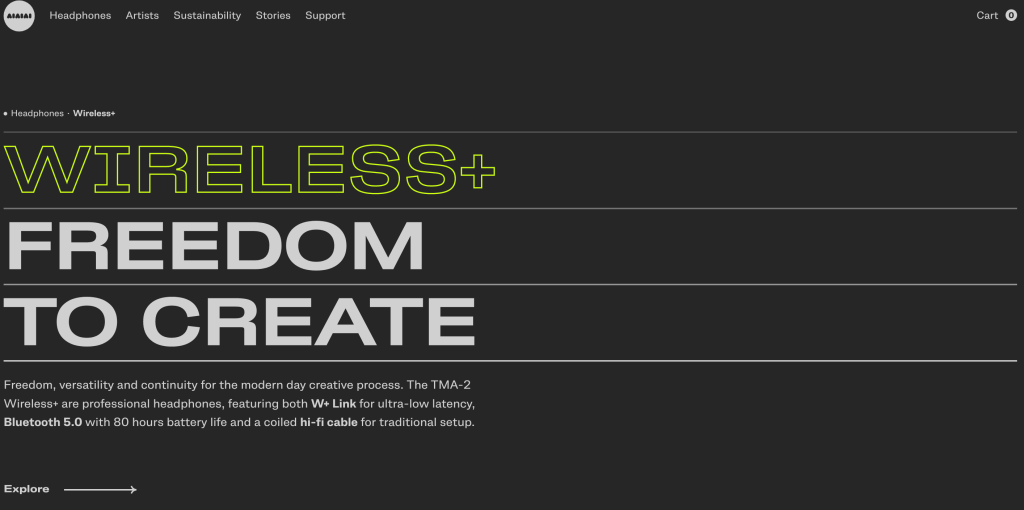
On this site there is consistency to the typography and the design. The text is easy to read and navigate. It compliments the overall feeling of what the website is about and the typography implement with the design. The text is properly sized and they use the same two fonts which makes it clean and simple in a good way.
